

Let’s get this out of the way: Pinterest is not really a social media platform. It’s actually a visual search engine masquerading as a social media platform. Very clever, Pinterest. What this means is that although your search results are returned using some high-tech new-fangled algorithmic search engine technology (that’s the search engine part), people actually decide what to click on based on images (that’s the visual part). So having gorgeous, clickable pins is crucial for success on Pinterest.
That said, not every successful pin is beautiful, and not every beautiful pin is successful. I’m sure we can all give some anecdotal examples of times that a hideous pin went viral (here’s one of mine. Like, it literally has terrifying clowns on it. How is it so popular?!)
Or maybe there was a time that you created the most beautiful pin in the history of pins and it went …. Nowhere.
Well, if Pinterest success was as easy as creating a pretty pin and clicking “publish,” I’d be out of a job. Or I’d be a millionaire pin designer. Could go either way.
So, while beautiful pin design is one element of a successful pin, it isn’t the be-all end-all. That said, it certainly helps. Like, a LOT.
But what does it mean to have a good-looking pin? I mean, isn’t it all subjective? Isn’t beauty in the eye of the beholder? Like, my husband thinks I’m gorgeous, but if you saw what I look like when I roll out of bed in the morning covered in drool, chances are you’d recoil in horror. Are pins the same way?
The short answer is: no. Pins aren’t inherently beautiful; they adhere to the rules of design. And there is absolutely such a thing as good design and bad design.
The elements of a pin roughly break down into 2 crucial parts: Image, and Text.
We’ll get to text next time. Today, we’re diving deep into the decision-making process you’ll go through before designing each and every pin: what picture should I use?
Table of Contents
Why does your Pin image matter?
The first thing someone sees on your Pin is the image (or multiple images) that you’ve chosen for your Pin design.
Your image needs to accomplish 3 crucial things:
- It needs to be attention-grabbing enough to stand out during a midnight scroll-session
- It must be beautiful enough to inspire that tingly “I want it” feeling that we all seek out on Pinterest
- It should convey something about the link that you’re trying to get people to click through to
So like, no pressure.
Here’s what you need to know about choosing what image to use on your pin.
Always use a high-quality image on your pins
The first thing that will draw someone’s eye to your pin is your image. It must be beautiful and high quality. What I mean by high quality is that it shouldn’t look like it was taken with the first Nokia camera phone in the late 90’s.
Your image should be high-resolution, so that when you stretch to make it bigger, the quality stays the same. It should be clear and not blurry at all.
Unfortunately, not all of us are professional photographers, and having a great image lying around that you can use for your Pin design is much easier said than done.
What if I don’t have a good quality image to use on my pin?
Photos are often that last piece of the puzzle preventing a “good” pin from being “great.” Sometimes, if you don’t have a good quality image to use, it’s super tempting to just shrug and use a not-so-good image.
But there’s a really easy way around this problem: if you don’t have your own high quality images, you can always use free stock photos!
There is NO SHAME in using a site that offers copyright-free stock images for your pins. Trust us, all the pros are doing it. And by “all the pros” I’m definitely referring to us. You think we took all of those pictures of computers sitting on neatly organized desks that we use all over our pins? Ha! My desk has NEVER been that organized.
Use (or create) a vertical image
Everyone talks about how pins should be vertical for a good reason: that’s what works on Pinterest. Google “how to Pinterest for dummies” or whatever (look, I never said I was good at SEO) and steps 1-5 are usually just different variations of the word “vertical.”
So yes, vertical pins are crucial.
But your images don’t necessarily have to be vertical.
Sure, it’s easiest when a photo will be vertical, too. That makes the whole “vertical pin” thing a LOT easier. But you can still create a vertical Pin even if you don’t have a vertical photo to use!
- Question: What if you don’t have a vertical image to use on my pin?
if you don’t have a vertical image, you can always stack a few horizontal images on top of one another. Ta-da! Magically vertical images.
Here’s an example of 2 pins I made using horizontal images stacked to make a vertical pin:


You can also sometimes stretch and manipulate a high-quality horizontal image just right so that it works for a vertical image, too.
Here’s an example of the exact same posts from above, using the same horizontal photos, but stretched to work as a vertical image:


See? Everything is possible. Except when you have a poor quality image and it gets really pixelated and miserable when you start to stretch it out. See guideline #1.
Avoid dark images
Pinterest is all about light, bright, airy, ~inspirational~ images. Save the dark stuff for Tumblr.
That said, of course there are always exceptions. Like, if your pin is about the best places to go star-gazing, sure – use a night-time picture. Just make sure it’s super high quality and visually interesting (so like, not just a black picture with a couple of white dots.) Or if your pin is about making charcoal flavored ice cream or whatever the hot new food trend is these days, it’s OK that the subject of your photo is going to be black.
That said, if you do have to use a dark image, try to contrast it with something light. Like, put your midnight black ice cream in a bright, white bowl. Or stick some trees in front of your starry sky, like this – or maybe something in the foreground, like this.
But, if you can avoid using darker images, do. A bright/light image is generally going to work better in a Pin than a dark one.
Avoid people’s faces in your pin images
There have been scientific studies that show that for whatever reason, Pinterest users have some kind of horrible aversion to people’s actual faces on Pinterest. Pins without faces are re-pinned 23% more than pins with faces in them.
So try to avoid any faces in your photos (unless they’re really far away, in which case you’re fine).
Luckily, there are zillions of pictures of people looking away from the camera on stock image sites. And you thought stock images were mostly pictures of women laughing and eating salad, didn’t you?
Avoid anything “gross”
Pictures of anything that could be considered “gross,” or even just generally unappealing, should be avoided at all cost on Pinterest.
Here’s a rule of thumb: if you wouldn’t tear the image out of a magazine and stick it on your wall to ~inspire~ you, you don’t want it on Pinterest.
This includes images of food that looks gross, anything involving bugs, or pictures of things that belong in toilets.
Sure, this is somewhat subjective. But ask yourself: if it would make a toilet-humor loving 5-year old giggle and say “EWWW!”, is it really the best choice for your pin? Spoilers: no.
- Question: But what if the subject of my Pin is kinda gross?
Fair question. Sometimes, you just can’t get around the fact that you’re solving an icky problem for your readers.
Woah, how convenient – that leads us right into our next guideline! I know, I know. It’s OK, you can save the applause for later.

Use an image that’s connected to your subject
When it comes to choosing pictures for your pins, it doesn’t always have to be an exact representation of the subject of your post.
For example, if you write a post about 16 ways to clean your gutters for free (full disclosure: I have never cleaned a gutter in my life, and I have no idea if there is more than 1 way to do this, so please use your imagination here) you do NOT have to use an image of like … a dirty gutter, or someone cleaning a gutter.
You can use a picture of a beautiful house. Or a gorgeous yard. Or like, ~autumn leaves. Or just someone looking at how beautiful their home is (but facing away from the camera – see guideline #4).
You can use any image that answers the question “how you’ll feel when you know how to clean your gutters for free using my guide that you found on Pinterest.”
Is your article about cleaning toilets? Don’t use a picture of a dirty toilet. Ew. Use a picture of a beautiful, clean bathroom.
What if you’re linking to a post about bed bugs? For the love of Pinterest, do not use a picture of bed bugs. Use a picture of a bed that does NOT have bed bugs. Or a picture of a bed-bug-free travel destination.
So long as your image is vaguely connected to the subject of your link/the text on your image, you can get pretty fast and loose with actual image you’re using. Being literal with your images is definitely NOT a requirement.
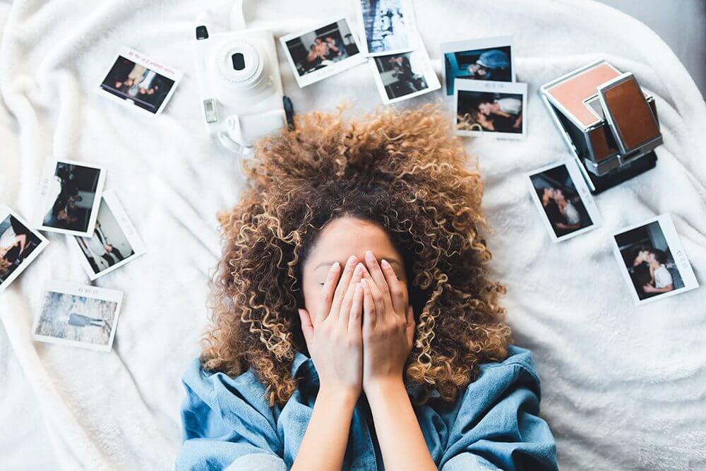
Here’s an example: this is the feature image I’m using for the Pin for this post. Is it related? Ehhh … Sort of? Does it get the point across? I think so!
Look for colors that work well on Pinterest
According to science, certain colors work better on Pinterest than others. Science says that warm colors, like pink or red or orange, work best on Pinterest.
So when you’re choosing a photo for Pinterest, sticking with the “warm colors” family is a safe bet.
That’s not to say that you shouldn’t use cooler toned images, or images with lots of blue and green and cool tones in them. Or heck, even neutral colored images. This is a guideline, not a hard and fast rule. You can be a rebel! I’m just reporting what the science says.
When you’re choosing your images, think about the colors of the image you’re choosing as well as the brightness of those colors. In general, lighter colors work better on Pinterest than dark colors. Which makes sense, since we already talked about avoiding dark photos – see Guideline #3.
Important note: when I say “bright,” I don’t mean like, “neon.” A nice pastel pink is far more visually appealing than a bright, in-your-face red.
Another super important thing to consider when you’re thinking about color is to avoid troublesome color combinations, like these.
This will come into play when you’re adding your text onto your image. If you already know that your text is going to be purple – because of your branding, or whatever – then you should avoid, say, a very green image, because purple and green are complementary colors.
I know that “complementary colors” sounds like they would go together, but it actually means that you should avoid using them together when it comes to text. Here’s a quick primer on color theory if you have no idea what I’m talking about.
If all else fails, go for humor
Humor will get you pretty far, you guys.
Humor can take an otherwise completely average Pinterest tutorial – er, I mean Pin – and make it great.
You know that Pin I linked to in the very first paragraph? With the scary clowns? (If not, here it is again).

That pin works because it’s funny. Make someone laugh, and they’ll automatically like you (at least, that’s what I always tell myself).
At the very least, make someone laugh, and they’re far more likely to click through your pin! When it comes to choosing a pin image, if you’re truly stumped, go for something funny. It totally works on Pinterest. It works everywhere.
The right combination of words + a random stock image can make your Pin truly great. If you need some inspiration, spend the next hour or so on this site. You’re welcome.
Follow these guidelines the next time you make a Pin and you’ll find yourself turning out gorgeous Pins in no time. ‘
And if you forget, here’s the gist: your Pinterest picture should be beautiful and inspiring, and give you that warm, fuzzy, “tomorrow when I wake up I’m going to be a better version of myself” feeling.
That’s what Pinterest was made for. It’s a warm-fuzzy-feelings factory. Or the false promises factory, depending on your level of optimism. I’m optimistic, so I’m going with the warm fuzzies. In related news, my front page still has a LOT of animal memes on it thanks to this post.
Above all else, I hope you think of us the next time you scroll through some stock photos of women giggling and holding spoonfuls of yogurt.
Do you have any questions about choosing an image on Pinterest? Leave me a comment below!
FOLLOW US!
Hey, speaking of Pinterest, how about sharing this?
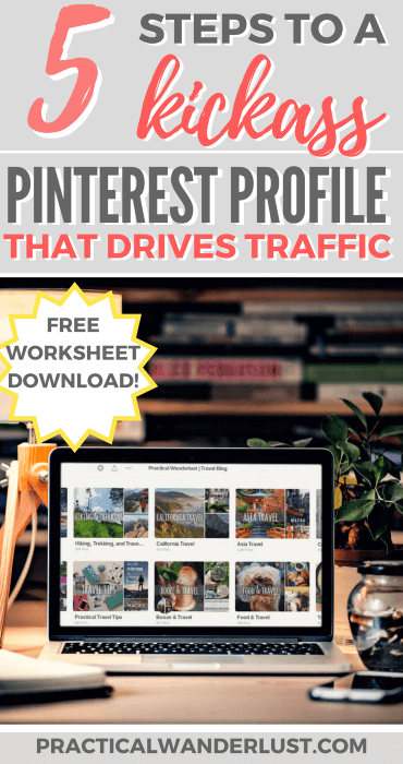
Get the 5-Step Pinterest Profile Makeover Checklist!
Sign up below and I'll send you a printable copy of the 5-Step Pinterest Profile Makeover Checklist. Opt-in to the 5 Day Pinterest Profile Makeover Challenge to help you complete the worksheet!
Our Top Travel Tips & Resources
- Booking Flights: To score flight deals, search on Google Flights or Kayak. Money-saving tips: fly mid-week or on the weekend; fly carry-on only on a budget airline; and take red-eyes or early morning flights.
- Accommodations: We usually stay in budget-friendly vacation rentals, boutique hotels or private rooms in hostels. We use Booking.com to book hotels (we love their flexible cancellation policy) and Hostelworld to book hostels (low deposit, easy change/cancellation, and excellent reviews). For vacation rentals, we prefer to book using VRBO because they've got lower fees and better support than Airbnb, and we're not fans of Airbnb's unethical track record. You can also book vacation rentals on Expedia and Hotels.com. We also use TrustedHousesitters as both hosts (for our home and our fur-child) and travelers!
- Travel Insurance: We always, always, ALWAYS buy travel insurance for international trips, and we STRONGLY suggest it - visit our Travel Insurance Guide to find out why. We recommend either World Nomads or SafetyWing for international travel insurance. SafetyWing is one of the few policies that covers Covid-19, and they have excellent monthly policies that are perfect for Digital Nomads and long term travelers!
- Travel Credit Card: We book all of our trips on our favorite travel credit card. Not only do we earn cash back that we can spend on more travel, but the card offers fantastic travel perks like travel insurance, trip delay and cancellation coverage, lost baggage reimbursement, and rental car coverage, which helps protect us on our travels. Learn more here.
- Vaccines & Meds: We use the travel guides on the CDC website to research recommended medications and vaccines for international trips. We always recommend getting every vaccine recommended by the CDC! You can get them at your primary care doctor's office or a walk-in pharmacy.
- Tours: We love booking guided tours, especially food tours and walking tours, to get a local's perspective and a history lesson while sight-seeing! We book our tours using Viator and GetYourGuide.
- Transportation: We use Rome2Rio to figure out how to get from place to place, and book local transportation online using Bookaway wherever we can. When we book a rental car, we use DiscoverCars to compare rental companies and find the best deal.
- Luggage Storage: Whenever we're checking out early or taking advantage of a long layover, we use LuggageHero to safely store our luggage while we're running around. Use the code PRACTICALW for 2 hours of free luggage storage on us.
- VPN Service: A VPN keeps your digital information (like website login details, bank info, etc) safe, even when you're connected to an unsecured network while traveling. Plus, it lets you use Netflix & other streaming sites abroad! We use NordVPN. Use the code WANDERLUSTPROMO when you sign up!
- What to Pack: Here are the travel essentials that we bring on every trip. We also have packing lists for hot weather, cold weather, and many more. Take a look at all of our packing guides!
Leave a Reply